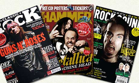
Within almost all magazines, the masthead is a pretty common convention. This is because it cannot be experimented with completely as it is a vital selling point, due to the way magazines are stacked in a shelf. Therefore almost all mastheads follow the same pattern of a bold title across the top third of the page, in which the magazine name is displayed. Exceptions to this are for example, Q magazine, where a single logo is used on the left hand side.
Another convention is the barcode. Obviously, this has the purpose of allowing the customer to purchase the product, but also often contains pricing, issue number and so on. The barcode is pretty much always in the bottom right hand corner, if not there than the bottom left. This is mainly so that the masthead, coverlines and splash are not blocked out by it, and it is in a point of minimum interest.

The photograph on the cover is an important part of the magazine. This is the most eye-catching feature, and the audience need to recognise what the image is of/about in order to gain interest. Therefore, for my own image I need to have something that reflects my magazines style. Hip-Hop magazines in general tend to have a close up/mid-shot of the artitst, with usually a fairly arrogant or cocky pose. As Hip-Hop artists tend to be of African-American ethnicity, I feel a similar style of model will be good for my images, as it ties in with current conventions and makes the magazine credible.


No comments:
Post a Comment